Templatization is an important WPF feature for controlling presentation with templates. WPF grid supports templatization of its various components such as cells, columns and some others.
This topic contains the following sections.
 Cell templates
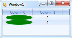
Cell templatization enables usage of any controls in grid cells via data templates. Templates are usually defined as resources in XAML files. To use a template, it should be set in the required grid column. An example of creating and using simplest XAML template for a grid cell is shown below.
| XAML |  Copy Copy |
|---|---|
<Window x:Class="TestApplication.Window1" xmlns="http://schemas.microsoft.com/winfx/2006/xaml/presentation" xmlns:x="http://schemas.microsoft.com/winfx/2006/xaml" xmlns:df="clr-namespace:Dapfor.Wpf.Controls;assembly=Dapfor.Wpf" xmlns:TestApplication="clr-namespace:TestApplication" Title="Window1" Height="427" Width="724"> <Window.Resources> <!--Declare a collection of data objects--> <TestApplication:MyCollection x:Key="someCollection" /> <!--Easiest cell data template--> <DataTemplate x:Key="cellTemplate"> <Ellipse Fill="Green"/> </DataTemplate> </Window.Resources> <!--Use GridControl as a single child of Window1 --> <df:GridControl Name="grid" ItemsSource="{StaticResource someCollection}"> <df:GridControl.Headers> <df:Header> <df:Header.Columns> <df:Column Id="Value1" Title="Column 0" CellTemplate="{StaticResource cellTemplate}" Width="100" /> <df:Column Id="Value2" Title="Column 1" Width="100" /> </df:Header.Columns> </df:Header> </df:GridControl.Headers> </df:GridControl> </Window> | |
Data binding to cells
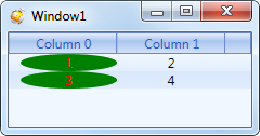
Cell data templates enable simple binding to cell content. For this purpose an object of Cell type is transferred as DataContext. This object has many useful properties including Cell.Text can be used for displaying text.
The following code shows how to display values returned by grid data object properties.
| XAML | Copy |
|---|---|
<Window.Resources> <TestApplication:MyCollection x:Key="someCollection" /> <DataTemplate x:Key="cellTemplate"> <Grid> <Ellipse Fill="Green"/> <TextBlock Text="{Binding Path=Text}" HorizontalAlignment="Center" Foreground="Red"/> </Grid> </DataTemplate> </Window.Resources> | |
Data binding and value converters
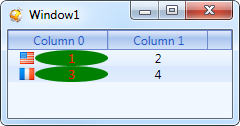
An object of Cell type has Cell.Value property that can be used to get unformatted values of data objects. These values can be used in cell data templates via converters. An example of converting a value to a country flag icon is shown below:
| XAML | Copy |
|---|---|
<Window.Resources> <TestApplication:MyCollection x:Key="someCollection" /> <TestApplication:IntToFlagValueConverter x:Key="intToFlagConverter"/> <DataTemplate x:Key="cellTemplate"> <Grid> <Image Source="{Binding Path=Value, Converter={StaticResource intToFlagConverter}}"/> <Grid Grid.Column="1"> <Ellipse Fill="Green"/> <TextBlock Text="{Binding Path=Text}" HorizontalAlignment="Center" Foreground="Red"/> </Grid> <Grid.ColumnDefinitions> <ColumnDefinition Width="Auto"/> <ColumnDefinition/> </Grid.ColumnDefinitions> </Grid> </DataTemplate> </Window.Resources> | |
As an example we shall review a simple Value converter that converts int type data to an image that corresponds to this value. Value is taken from Cell.Value that calls underlying data object property.
| C# | Copy |
|---|---|
public class IntToFlagValueConverter : IValueConverter { static readonly BitmapImage FlagFrance = new BitmapImage(new Uri("/Images/flag_france.png", UriKind.Relative)); static readonly BitmapImage FlagRussia = new BitmapImage(new Uri("/Images/flag_russia.png", UriKind.Relative)); static readonly BitmapImage FlagUsa = new BitmapImage(new Uri("/Images/flag_usa.png", UriKind.Relative)); public object Convert(object value, Type targetType, object parameter, CultureInfo culture) { if(value is int) { switch((int) value) { case 1: return FlagUsa; case 2: return FlagRussia; case 3: return FlagFrance; default: return FlagFrance; } } return null; } public object ConvertBack(object value, Type targetType, object parameter, CultureInfo culture) { return Binding.DoNothing; } } | |
DataTemplate selector
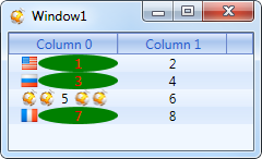
As we have shown above, different data templates can be set in different columns. These templates are applied to all cells of the column where a template is set. However, sometimes you need to use different templates for different rows. For this purpose Column class provides Column.CellTemplateSelector property that can be used to set a data template selector in run-time. An example of data template selector usage is shown below.
| C# | Copy |
|---|---|
class CustomTemplateSelector : DataTemplateSelector { public DataTemplate Template1 { get; set; } public DataTemplate Template2 { get; set; } public override DataTemplate SelectTemplate(object item, DependencyObject container) { var cell = item as Cell; if (cell != null) { return cell.Row.VisibleIndex == 2 ? Template2 : Template1; } return base.SelectTemplate(item, container); } } | |
| XAML | Copy |
|---|---|
<Window.Resources> <TestApplication:MyCollection x:Key="someCollection" /> <TestApplication:IntToFlagValueConverter x:Key="intToFlagConverter"/> <BitmapImage x:Key="image" UriSource="/Images/dapfor.ico" DecodePixelWidth="16" DecodePixelHeight="16" /> <!--Data Template 1--> <DataTemplate x:Key="Template1"> <Grid> <Image Source="{Binding Path=Value, Converter={StaticResource intToFlagConverter}}"/> <Grid Grid.Column="1"> <Ellipse Fill="Green"/> <TextBlock Text="{Binding Path=Text}" HorizontalAlignment="Center" Foreground="Red"/> </Grid> <Grid.ColumnDefinitions> <ColumnDefinition Width="Auto"/> <ColumnDefinition/> </Grid.ColumnDefinitions> </Grid> </DataTemplate> <!--Data Template 2--> <DataTemplate x:Key="Template2"> <StackPanel Orientation="Horizontal"> <Image Source="{StaticResource image}"/> <Image Source="{StaticResource image}"/> <TextBlock Text="{Binding Path=Text}" Margin="5,0,5,0"/> <Image Source="{StaticResource image}"/> <Image Source="{StaticResource image}"/> </StackPanel> </DataTemplate> <!--DataTemplate selector--> <TestApplication:CustomTemplateSelector x:Key="tempateSelector" Template1="{StaticResource Template1}" Template2="{StaticResource Template2}"/> </Window.Resources> <df:GridControl Name="grid" ItemsSource="{StaticResource someCollection}"> <df:GridControl.Headers> <df:Header> <df:Header.Columns> <df:Column Id="Value1" Title="Column 0" CellTemplateSelector="{StaticResource tempateSelector}" Width="100" /> <df:Column Id="Value2" Title="Column 1" Width="100" /> </df:Header.Columns> </df:Header> </df:GridControl.Headers> </df:GridControl> | |
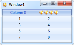
Column templates
In addition to data display templatization, Wpf GridControl also supports column templatization. Programmers can use XAML code to set desired presentation. This requires using Column.ColumnTemplate property for setting any arbitrary DataTemplate.
An example of using DataTemplate in grid column is shown below.
| XAML | Copy |
|---|---|
<Window.Resources> <BitmapImage x:Key="image" UriSource="/Images/dapfor.ico" DecodePixelWidth="16" DecodePixelHeight="16" /> <DataTemplate x:Key="columnTemplate"> <StackPanel Orientation="Horizontal" Height="16" HorizontalAlignment="Center"> <Image Source="{StaticResource image}"/> <Image Source="{StaticResource image}"/> <Image Source="{StaticResource image}"/> <Image Source="{StaticResource image}"/> </StackPanel> </DataTemplate> </Window.Resources> <!--Wpf Grid--> <df:GridControl Name="grid" ItemsSource="{StaticResource someCollection}"> <df:GridControl.Headers> <df:Header> <df:Header.Columns> <df:Column Id="Value1" Title="Column 0" Width="100"/> <df:Column Id="Value2" Title="Column 1" Width="100" ColumnTemplate="{StaticResource columnTemplate}" /> </df:Header.Columns> </df:Header> </df:GridControl.Headers> </df:GridControl> | |