Prev topic: .Net Grid tutorial (Part6: Threadsafe BindingList)
Next topic: .Net Grid tutorial (Part8: Cell highlighting)
The grid provides flexible and convenient features to configure painting of every element including cells, odd and even rows, grouping rows, headers, columns and other elements.
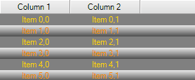
All element settings are grouped in Grid.Appearance property and are accessible in both design-time and run-time mode. In most cases, appearance setup is performed via Appearance class that sets background color (and can set gradient as well) and foreground color (usually text color). For example, color setting for odd and even rows will look as follows:
| C# | |
|---|---|
//Even colors grid.Appearance.EvenRows.ForeColor = Color.Gold; grid.Appearance.EvenRows.BackColor = Color.Gray; //Odd colors grid.Appearance.OddRows.ForeColor = Color.DarkOrange; grid.Appearance.OddRows.BackColor = ControlPaint.Light(Color.Gainsboro); grid.Appearance.OddRows.GradientEnabled = true; grid.Appearance.OddRows.GradientDirection = GradientDirection.Vertical; grid.Appearance.OddRows.GradientEndBackColor = ControlPaint.Dark(Color.Gainsboro); | |
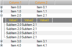
.Net Grid can work as tree-list view with a single header or as a fully-featured grid with multiple headers. For color setting, the header uses Header.Appearance property that can set appearance of both header and rows at hierarchy level of this header. The example below demonstrates color setup for a header and its columns.
| C# | |
|---|---|
//Top-level header grid.Headers[0].Appearance.ColumnPanel.BackColor = Color.LightGray; grid.Headers[0].Appearance.ColumnPanel.ForeColor = Color.DarkOrange; grid.Headers[0].Appearance.ColumnPanel.GradientEnabled = true; grid.Headers[0].Appearance.ColumnPanel.GradientEndBackColor = Color.DarkGray; grid.Headers[0].Appearance.ColumnPanel.GradientDirection = GradientDirection.Vertical; //Child header grid.Headers[1].Appearance.ColumnPanel.BackColor = Color.Gray; grid.Headers[1].Appearance.ColumnPanel.ForeColor = Color.Gold; grid.Headers[1].Appearance.ColumnPanel.GradientEnabled = false; | |
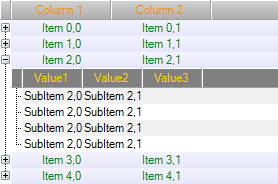
The following code shows a method of changing content color scheme at the header’s hierarchy level:
| C# | |
|---|---|
//Top-level content grid.Headers[0].Appearance.OddRows.ForeColor = Color.Green; grid.Headers[0].Appearance.OddRows.GradientEnabled = true; grid.Headers[0].Appearance.OddRows.GradientDirection = GradientDirection.Vertical; grid.Headers[0].Appearance.OddRows.BackColor = ControlPaint.LightLight(Color.Lavender); grid.Headers[0].Appearance.OddRows.GradientEndBackColor = Color.Lavender; //Copy odd appearance to even rows grid.Headers[0].Appearance.EvenRows = grid.Headers[0].Appearance.OddRows; | |
It is possible to set individual colors for each column in a header and for cells that correspond to this column. To improve visual perception of information, the grid supports semi-transparent dithering of colors set for rows and cells controlled by the column. To use this feature, just set a content color with a semi-transparent alpha factor. An example of color dithering in grid cells is provided below.
| C# | |
|---|---|
Column column = grid.Headers[0]["Column 2"]; column.CaptionImage = Resources.star_yellow; column.Appearance.CaptionImageSettings.Alignment = ContentAlignment.MiddleLeft; column.Appearance.CaptionImageSettings.Padding = new Padding(2, 0, 0, 0); column.Appearance.CaptionFont = new Font("Arial", 10, FontStyle.Bold); column.Appearance.CellForeColor = Color.DarkRed; column.Appearance.CellFont = new Font("Arial", 8, FontStyle.Italic); column.Appearance.CellBackColor = Color.FromArgb(20, Color.Red); | |
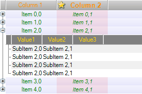
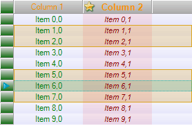
In addition to the above grid elements, it is also possible to manage other elements:
- Row and header selectors
- Selection color with semi-transparent mode support
- Focused row color with transparency support
- Color of cell border lines
| C# | |
|---|---|
//row selectors grid.RowSelector.Visible = true; grid.RowSelector.Appearance.BackColor = Color.LightGray; grid.RowSelector.Appearance.GradientEndBackColor = Color.DarkGreen; grid.RowSelector.Appearance.GradientDirection = GradientDirection.Vertical; grid.RowSelector.Appearance.GradientEnabled = true; //Selection grid.Selection.Color = Color.FromArgb(60, Color.Goldenrod); //Focused row grid.FocusSettings.Color = Color.FromArgb(60, Color.LightSeaGreen); | |
All the above examples simultaneously manage color of all elements of the same type. If it is necessary to set color for each individual element, the grid enables setting this color directly when painting. For this purpose, the grid provides a set of callbacks that enable a programmer to completely redefine appearance of each element separately. Appearance management method is approximately the same for painting of every element. Generally, PaintXXXEventArgs argument that is sent to callback contains calculated appearance that can be modified by a programmer and information of element parts that have to be painted. This information is set in PaintXXXEventArgs.PaintPart property and can also be modified. PaintXXXEventArgs also provides a set of methods for painting different element parts (text, background, vertical and horizontal dividers, etc). Finally, PaintXXXEventArgs has Handled property that tells the grid that the element is already painted and doesn’t require re-painting. Therefore, the provided interface is as complete as possible and enables a programmer to fully customize painting of each individual element or its part using minimum code. This means that a programmer can modify element colors during painting as well as perform default painting and add custom painting code or perform a reverse operation.
An example of cell color customization by modifying PaintCellEventArgs.Appearance and adding an icon:
| C# | |
|---|---|
grid.PaintCell += delegate(object sender, PaintCellEventArgs e) { if(e.Cell.Column != null) { if ((e.Cell.Column.Id == "Column 1" && e.Cell.Row.VisibleIndex == 4) || (e.Cell.Column.Id == "Column 2" && e.Cell.Row.VisibleIndex == 6)) { e.Appearance.GradientEndBackColor = Color.OrangeRed; e.Appearance.GradientDirection = GradientDirection.Horizontal; e.Image = Resources.star_yellow; e.ImageSettings.Alignment = ContentAlignment.MiddleLeft; } } }; | |
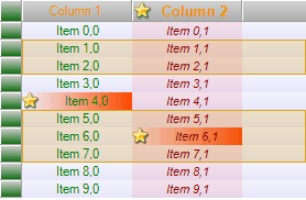
The following code demonstrates post-painting feature that is used when the entire cell including background, highlighting, text, etc. is already painted.
| C# | |
|---|---|
grid.PaintCell += delegate(object sender, PaintCellEventArgs e) { //Do default painting e.PaintAll(); e.Handled = true; //Add a custom routine if (e.Cell.Column != null && (e.Cell.Column.Id == "Column 2" && e.Cell.Row.VisibleIndex == 3)) { SmoothingMode mode = e.Graphics.SmoothingMode; e.Graphics.SmoothingMode = SmoothingMode.AntiAlias; Rectangle rc = e.Cell.VirtualBounds; rc.Inflate(-1, -1); e.Graphics.DrawEllipse(Pens.DarkBlue, rc); e.Graphics.SmoothingMode = mode; } }; | |
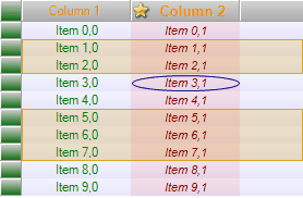
The following code demonstrates pre-painting followed by default code. In the example below, the code for painting cell background is executed first and is followed by default code that paints text, grid cell borders and other information.
| C# | |
|---|---|
grid.PaintCell += delegate(object sender, PaintCellEventArgs e) { //Paint background e.PaintBackground(); //Paint stars if (e.Cell.Column != null && (e.Cell.Column.Id == "Column 2" && e.Cell.Row.VisibleIndex == 3)) { Rectangle rc = e.Cell.VirtualBounds; while (rc.X + Resources.star_yellow.Width < e.Cell.VirtualBounds.Right) { ControlPaint.DrawImageDisabled(e.Graphics, Resources.star_yellow, rc.X, rc.Y, Color.Transparent); rc.X += Resources.star_yellow.Width; } //Prevent the grid from background painting e.Parts ^= e.Parts & PaintPart.Background; } //The e.Handled still equals to false. //The grid will paint remaining elements (text, selection etc.) excepting background. }; | |
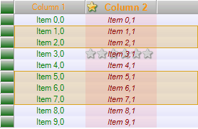
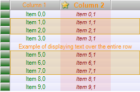
The same approach is used for re-painting columns or larger elements – rows and headers. Let’s provide an example of displaying text over the entire row.
| C# | |
|---|---|
grid.PaintCell += delegate(object sender, PaintCellEventArgs e) { if (e.Cell.Row.VisibleIndex == 4) { //Prevent the grid from text painting e.Parts ^= e.Parts & PaintPart.Text; } }; grid.PaintRow += delegate(object sender, PaintRowEventArgs e) { if(e.Row.VisibleIndex == 4) { //Do default painting e.PaintAll(); e.Handled = true; //Add a custom painting routine using (StringFormat sf = new StringFormat()) { sf.Alignment = StringAlignment.Center; sf.LineAlignment = StringAlignment.Center; e.Graphics.DrawString("Example of displaying text over the entire row", e.Font, Brushes.DarkOrange, e.Row.Bounds, sf); } } }; | |
Invalidation
Invalidation is a request for grid data repainting. The painting process in operating system is known to consist of two stages.
- It is necessary to define area for re-painting and to call Control.Invalidate(Rectangle rect) method.
- After some time Windows discovers that the control has an area for re-painting and generates two messages: WM_ERASEBACKGROUND and WM_PAINT, in which the painting operation is performed. These two messages are processed inside the Control, while a programmer may subscribe to Control.Paint event, where custom code can be added.
This process is asynchronous, i.e. Control.Invalidate() is not a blocking method and it supports sequential invalidation of multiple areas. However, WM_PAINT message is fired only once.
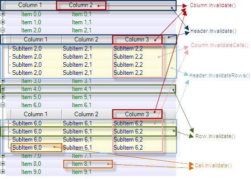
The Grid provides a set of methods that make it easier to re-paint various grid elements. A table with the list of methods for redrawing various elements is provided below. Please note that this concerns only area invalidation as re-painting is performed within WM_PAINT message.
| Element | Description |
|---|---|
| Cell.Invalidate()()()() | Repainting of a single cell. |
| Row.Invalidate()()()() | Repainting of a single row. |
| Header.Invalidate()()()() | Header invalidation. If the header is located in the hierarchical grid (not top-level header), all duplicates in visible surface are repainted. |
| Header.InvalidateRows()()()() | Repaint all rows in the grid on the same hierarchical level as the header. |
| Column.Invalidate()()()() | Column title invalidation. |
| Column.InvalidateCells()()()() | Repainting of all cells in the grid that are related to a certain column located on the same hierarchical level as a header. |
